Problem Statement
How might we enable musicians to form collaborative relationships and create an inclusive music community at the University of California: San Diego (UCSD)?
What is Triton Jam?
Triton Jam is the result of an intensive human centered design project. It is a mobile application that allows for musicians of all skill levels in the UCSD community to connect with one another.
My team of 6 started by choosing the general topic of music collaboration and through several rounds of user research, user testing, data analysis, and prototyping we arrived at a final working prototype that facilitates connection and collaboration between all musicians at UCSD.
Taking this approach of continually immersing ourselves into the lives and context of our stakeholders allowed us to avoid “designing from the I” and create an application that is user driven. Oftentimes disagreements on how to proceed with the design emerged, whenever possible we would allow the results of stakeholder feedback to inform the outcome of the design disagreement. By the completion of the project we had interviewed stakeholders for several hours, did 4 rounds of user testing and asked stakeholders countless times for some quick feedback.
This is a high-level overview of the project that, for the sake of brevity, leaves out significant details of our design making decisions. For a more in depth look into our processes and design making decisions check out this design brief and process portfolio.
Software Development
While this is a design project with no software development involved, there are a lot of takeaways from this project that I’ve applied in my approach to software development.
1. Moving forward with intentionality: Throughout the project we made sure to ask "Why?" a lot. This allowed us to rationalize each step of the design process and design with intentionality in mind. Each step of the design process requires a lot of decision making. This includes what features to change, how to represent different types of information, what processes to use as a group, what questions to include in various interviews, and what interactions are the most salient. Without asking ourselves "Why?" and continuing to utilize evidence to justify our design and process decisions, we would be rushing into a complicated process with no way to ground ourselves in reality and no way to move forward with intentionality.
I’ve taken this idea of moving forward with intentionality into programming. When I’m designing my approach to a programming problem or when I’m stuck on a bug, I ask “why?” at every stage. This has helped my approach to development immensely, and I find myself getting stuck on a bug or going down rabbit holes a lot less.
2. Understanding the system: A huge portion of this project was dedicated to understanding the music community as a whole, allowing us to discover and design for the root causes of different pain points brought up by stakeholders.
I view software as a system, layered with different programming languages, frameworks, technologies, and the code itself. Understanding this system makes it more intuitive to find where a bug is coming from, helping to quickly pinpoint and fix the bug.
Lessons Learned
1. Collaboration: Through the process of the project, I learned how collaboratively designing with multiple people could be challenging at times because of incorporating many diverse perspectives and opinions on one solution. Miscommunication also occurred a lot, and we often spent a lot of time clarifying details of the project within the group. To keep consistency, we developed style guides, had many feedback sessions, and spent hours making sure that the visual components within each iteration of the design maintained visual consistency.
2. Sheer amount of data can be overwhelming: When thinking about the design, we used tools such as design models, affinity diagrams, personas, and storyboards to help us consolidate and organize our research in useful ways to ensure that we were continuing to empathize with the stakeholders while developing our solution. Even with all these tools, I still often found the sheer amount of data overwhelming, and this emphasized the importance of data consolidation and organization.
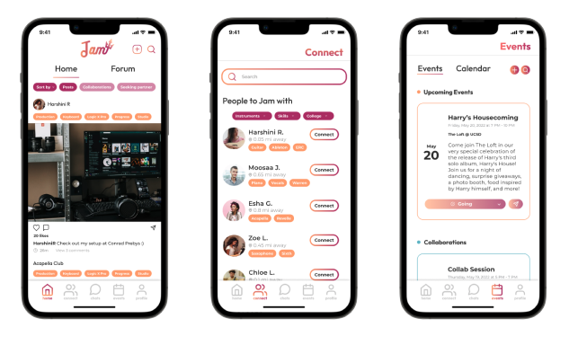
Final Design
Here is the final working prototype of the application:
Let’s take a look at how we got here.
Data Collection, Consolidation, and Ideation
Since we designed for the needs of the music community, especially regarding collaboration, the first step is immersing ourselves into the lives and context of the music community. We did this using a combination of stakeholder interviews, field research, and secondary research.
Stakeholder Interviews
We conducted 6 interviews, split evenly between primary and secondary stakeholders. Primary stakeholders are defined as those who create, produce, or songwrite pieces of original music. Secondary stakeholders are those who play instruments, are in music groups, or just general enjoyers of music. We created an interview protocol, in order to facilitate semi-structured interviews. This format gave the interviews structure and continuity across the different interview sessions, while still allowing for novel information to emerge. In order to better capture the interview sessions we asked participants for permission to record the sessions, and also summarized each interview in order to facilitate sharing our findings with each other.
Field research
One roadblock faced was, due to many stakeholders not having access to practice spaces, we were unable to place a heavy emphasis on the direct observation of musicians collaborating. However, one of our team members observed two students working together in a music studio at UCSD. She watched and took notes on their workflow, including the individualistic aspects of music production, and how they collaborated with each other to produce a succinct song. From observing these musicians, we learned that there is a large amount of importance placed on communication and different skill sets being utilized to produce music. This helped inform our design, as one of our main goals became allowing for people to communicate with other musicians with differing skill sets.
Secondary Research
We also did secondary research in order to get more context on the preferences of musicians and the process of collaboration. For example, we watched a video where two frequent collaborators who have a high level of familiarity with each other's musical style explicitly mention that they had a lot of trust in each other's creative decisions. This idea of familiarity being important to collaboration resonates with one of our stakeholders who mentioned that he prefers jamming with friends from his hometown over collaborating with strangers. Hence, from this secondary research paired with stakeholder interviews a theme on the importance of familiarity and complementary skills emerged. We decided to conduct some competitive analysis on music apps like Vampr that similarly facilitated connections between musicians and found that their feature prioritization is similar for tackling communication and collaboration between musicians.
Interpretation Sessions
Since there were 6 of us working on the project, a challenge we faced throughout the project was how to best share our findings with each other, along with utilizing the insights that having 6 people looking at the same data could bring.
Interpretation sessions helped meet this challenge. Each team member went through their stakeholder interview, while the rest of the group simultaneously asked questions to parse out further information, took notes on the recount of the interview, and captured snippets of insightful information. These sessions allowed for more information, trends, and a group understanding of our stakeholders to emerge.
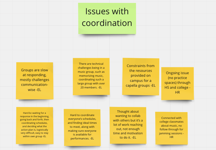
Affinity Diagramming
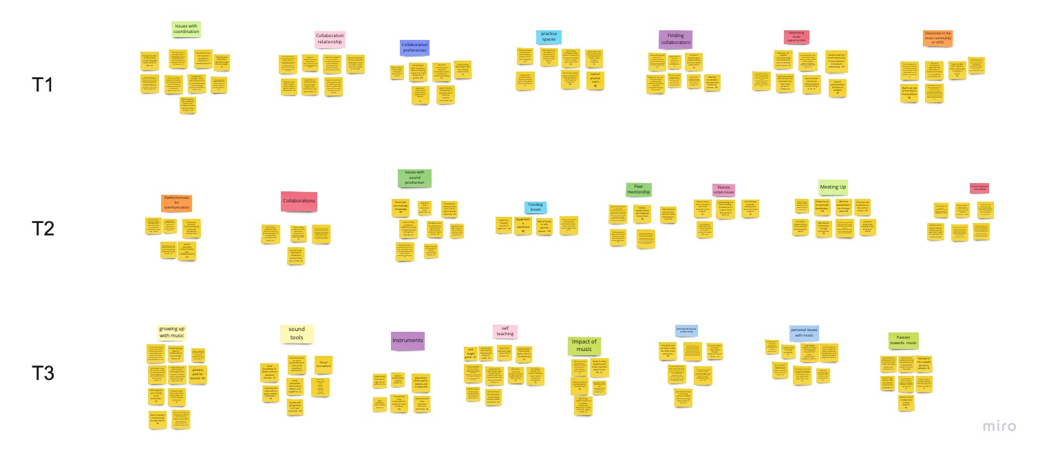
Affinity diagramming is a way to brainstorm and organize data into categories.
Check out our whole affinity diagram here.
We created a virtual sticky note for each snippet of information captured from the interpretation session. After that we began to organize the sticky notes into groups of 4-10 items. Lastly, we organized each group of sticky notes into tiers. The higher the tier level the more relevant it was to our topic of musical collaboration at UCSD.
Trends
Through stakeholder interviews, research, interpretation sessions and affinity diagramming a rich array of trends and pain points emerged. Here are some of the most prevalent trends:
1. Difficulty connecting with others musicians: All of our stakeholders mentioned difficulty finding other musicians to collaborate with. The issues stemmed from a feeling of isolation between different music groups, difficulty finding practice spaces, difficulty transporting instruments, difficulty advertising music clubs and events, and the skill-gap between musicians. Our final design aims to alleviate some of these issues by making it easier for users to find and communicate with other musicians.
2. Collaboration preferences: Stakeholders mentioned a variety of preferences for collaboration. These include similar music taste, skill level, musical style, and working with people who play specific instruments. While our aim throughout design is to create an inclusive music community, we recognize that stakeholders have preferences on who they collaborate with. Therefore, our final design aims to increase inclusivity by creating a space where everyone can find someone to match their collaboration preferences.
3. High burnout rate: Lack of community ties into another trend that emerged regarding a high propensity towards burnout among musicians. When discussing the challenges of music production, an interviewee stated that he had “no incentive” to jump back into music production. He wouldn’t want to collaborate with “just anyone” but he would be open to people with similar music preferences and “like-minded” individuals. Hence the ability to form a music community based on one’s preferences can provide incentive and motivation to produce music and reduce burnout.
4. Reluctance to perform: Anxiety and reluctance to perform music was a commonly cited trend across interviewees. This shows a potential pain point for music collaboration. Our final design aims to alleviate this anxiety, by creating a judgment free music community, and allowing for anonymous interactions between users.
Personas
In order to exemplify the different needs of our users we created six different personas. three modeled after our primary stakeholders, and three modeled after our secondary stakeholders. Creating these personas allowed us to empathize with our stakeholders, and emphasized the importance of designing with a human-centered mindset.
Brainstorming solutions
It was tempting to ideate on solutions throughout the process, however we wanted to take a bottom-up approach to the project and avoid “designing from the I”. To fit this goal we only started brainstorming solutions after spending significant time collecting and analyzing data, therefore making sure each of us had a high-level understanding of the needs and pain points in the community. While we did not strictly limit ourselves to having the solution come in the form of a digital application, we did lean fairly heavily towards these types of solutions. Both because we felt like a digital solution would successfully address our problem statement and because we were interested in increasing our UI Design skillset.
The main brainstorming method we used was called “Crazy 8’s”. This method calls for splitting a piece of paper into 8-sections. Then each group member gets 1 minute to brainstorm a potential solution to the problem or add to one of their previous solutions. This lasts for 8 sessions, and allows for a quick way to get a lot of ideas out there. After that each idea got transferred onto a virtual sticky note, and each team member talked through their idea. Based on group feedback, we chose 3 ideas to pursue further.
1. Musician centered peer networking app: This would give musicians a dedicated place to form a musical community, discover events, and find others to collaborate with.
2. Tinder-esque musician matching app: This would give musicians a way to describe their musical skill sets,their collaboration preferences, and would afford quickly increasing the number of people that musicians can connect with.
3. Practice space finder app: This would give people a space to list and find practice spaces available in their community. It addresses the common issue of college students not having a place to practice music.
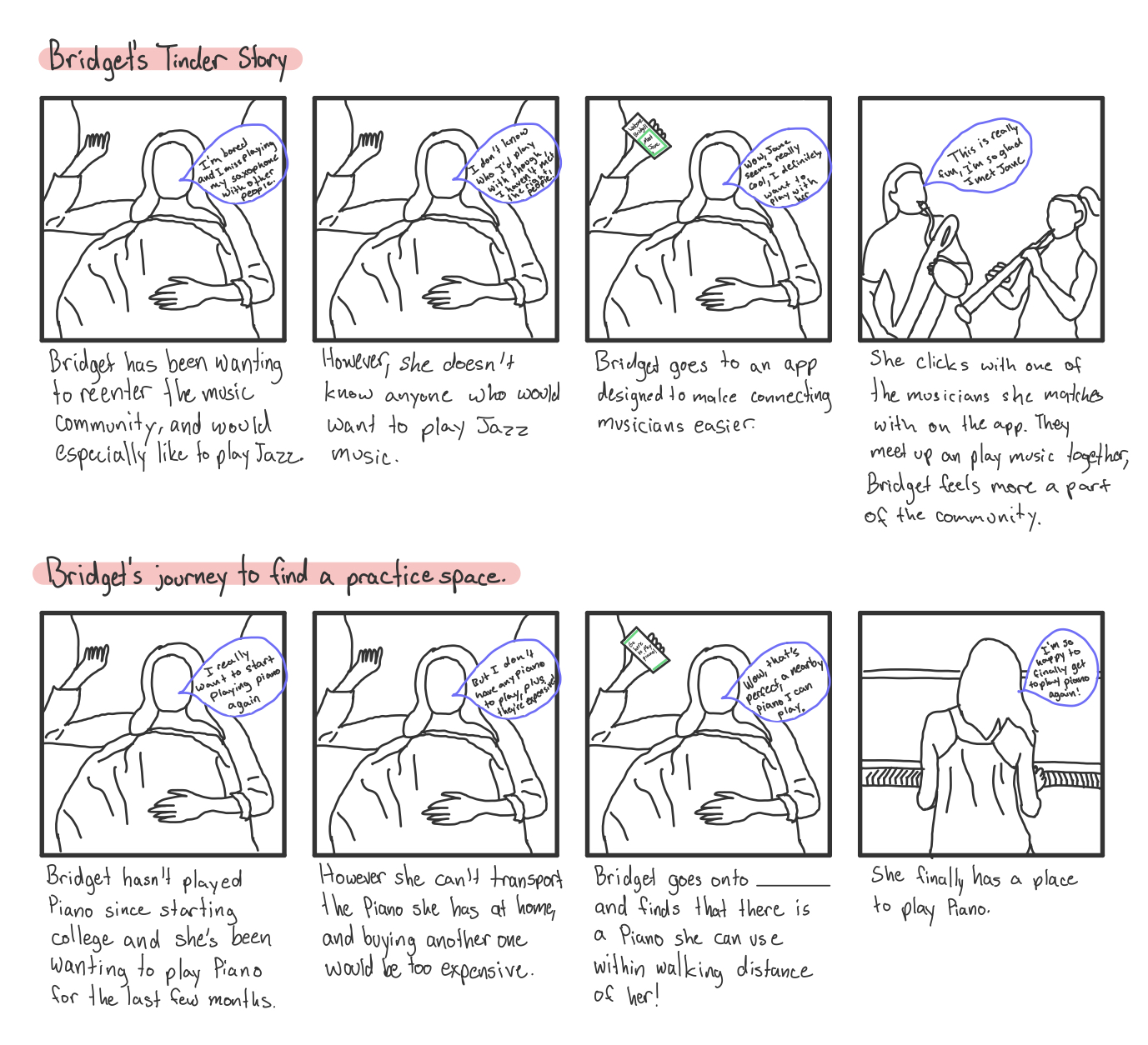
Storyboarding
As a way to provide clarity on where our potential solutions fit into the lives of our stakeholders, along with bringing up problematic scenarios for collaboration, we created 4 storyboards for each of the three solutions we considered pursuing. At this stage, the ideas we had were at a conceptual level, and therefore the storyboards address the essence of the idea, rather than an exact detail-oriented design.
Choosing a solution
While each solution had its pros and cons, we decided to pursue the idea of creating a musician centered peer networking app.
We eliminated the “Tinder-esque matching app” because we were worried that, while the idea would allow quick connections with a lot of musicians, it would also produce more shallow connections. Hence, it would not meet our goal of fostering long term collaboration. However, we were curious how users would respond to this idea, so we included the idea for this application as a sub-feature in the social networking application.
We eliminated the “practice space finder app” idea because it was unclear on the availability of practice spaces that would be willingly lent out to musicians. Had we pursued this idea further we would have engaged in user research to see what type of practice spaces exist, and the willingness of people with extra spaces to allow others to use that space. Unfortunately this type of research was outside the scope and timeline for the project.
In the end we decided to pursue the musician centered peer networking app because we felt the idea would best allow for creating an inclusive music community that would encourage collaboration. Since a social media type application has a variety of potential features, this idea also allows for opportunities to create features within the application to solve for specific pain points that our research uncovered.
Forming the solution
Based on our knowledge of our stakeholders, the user needs we wanted the application to address, and our general vision we defined some core functionality. This functionality is represented by the main “pages” in the application. We initially chose to design 5 different pages, with the knowledge that the pages and features we chose to include would get iterated on:
1. Profile: Biography of a musician
2. Feed: A place where users can view, interact with, and add music-related posts.
3. Chats: This is the area of the application where people can talk one-on-one or in groups with other musicians in the community.
4. Map: This feature allows users to find other musicians, practice spaces, and events near them
5. Recommend: This feature is the legacy of the “Tinder-esque app”. The page would recommend other musicians and events to the user, providing a quick way to connect with the music community
Prototyping
Now that we are done with our initial data collection and consolidation, and we have a solution in mind, it’s time to start figuring out how to visualize that solution.
Sketching
Each group member spent time ideating independently on how to visualize the features we had previously defined, and then presented a selection of their ideas to the group by uploading sketches to the miro board. Through the sketching process we were able to further flush out the direction of our app. After going over our sketches as a group, we refined the scope of the application, refined what content would exist in each page, eradicated one of the pages entirely, split Feed into Feed and Explore, and introduced two new pages.
The main goal of this product is to facilitate collaboration for the music community. After discussing Chats, we decided that Triton Jam’s main goal would be to establish an initial connection, rather than afford the actual collaboration of music creation to occur on the app. From our initial research, most of the issues surrounding collaboration stemmed from not being able to find people to collaborate with, rather than a lack of technologies that facilitate collaboration. The design ramification of this decision is that we left Chats very simple, instead of adding in design elements to facilitate music creation.
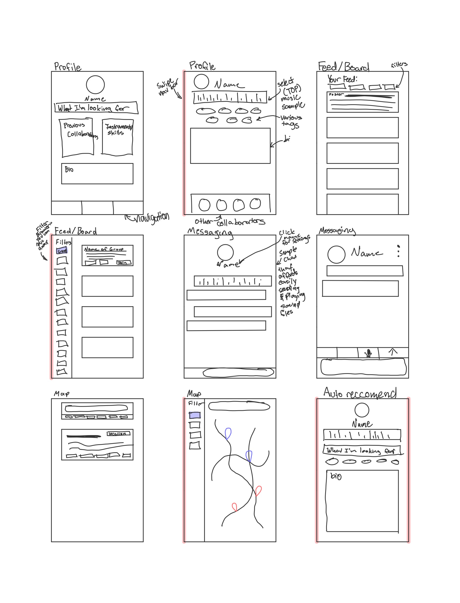
We took out the map feature entirely because, after quickly running the idea by stakeholders, we learned that a significant portion of users were uncomfortable with the idea of having their approximate distance public.
A couple team members had ideas for new pages:
1. Events: Allows users to view the events planned ahead of time with a “wallet” keeping track of specific details of the event. There is also a calendar view allowing for users to track their planned collaborations and events.
2. Progress: The goal of this page is to “gamify” the application, and provide an incentive for users to get further on their music journey.
Since these pages were the brainchild of individual team members, the ideas were less flushed out and we were unsure how the ideas would fare with users. However, we included the new pages into our low-fidelity wireframes. This was an example of holding back our own biases, and allowing the users to decide if they would find the pages helpful. Ultimately, Events made it into our final design, but Progress did not.
Wireframes, user testing, and iteration
We consolidated our design ideas into 2 wireframes: Version 1 (V1) and Version 2 (V2), and created a user-testing plan to figure out the pros and cons of our design. This allowed us to directly compare the effectiveness of the different layouts of our main screens (Feed, Explore, Profile, Chats). It also gave us an opportunity to play around with features we were interested in including in our design (Recommend, Progress, Events).
Ultimately, all of our stakeholders preferred V2 with some specific changes from V1. Although they were more indifferent to standard screen formats such as Profile and Chats, many of them took a liking to V2’s Explore because it felt more fleshed out and usable.
Furthermore, the process of testing wireframes with users called attention to what parts of the prototype require more detail in future iterations and led to frank discussions about what users may or may not use within the application. Recommend received mixed feedback, and we therefore decided to take it out. We later replaced the idea of this page with Connect.
One stakeholder mentioned that she does not see herself posting her work to Feed as it is personal and vulnerable to do so, and others showed the same sentiment. This feedback led us to splitting Feed into Feed and Forum, with Forum allowing for anonymous posting helping to fix the issue of users feeling vulnerable when posting.
We then consolidated the feedback into a V3 wireframe:
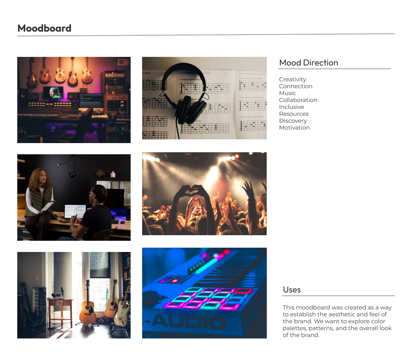
Branding and Aesthetics
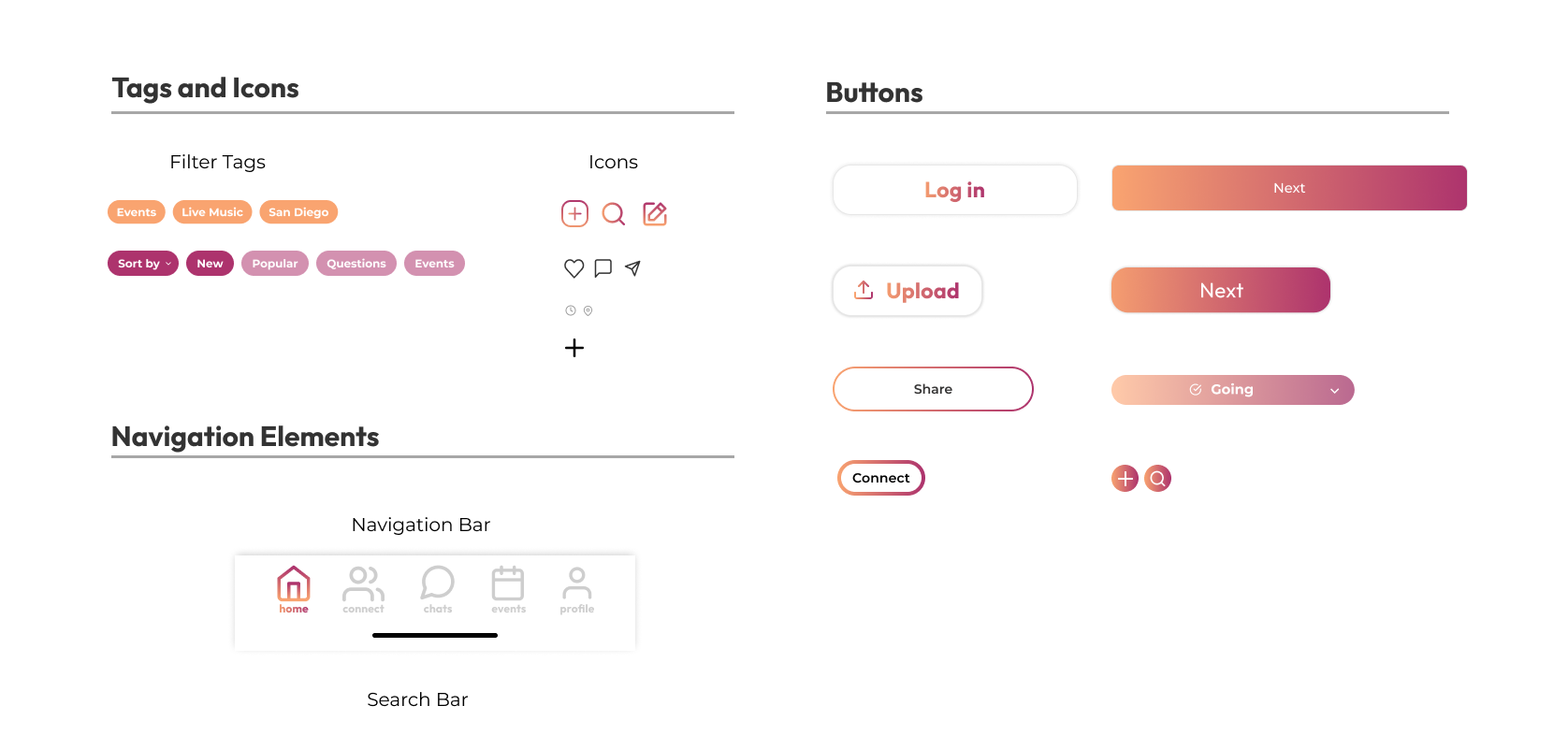
As UI designers we spent the majority of our efforts iterating on the content and interactions present in the application. However, we did spend time developing a style and branding guide for our application in order to create a standard look and feel to each element of the application, and help portray the message of the application.
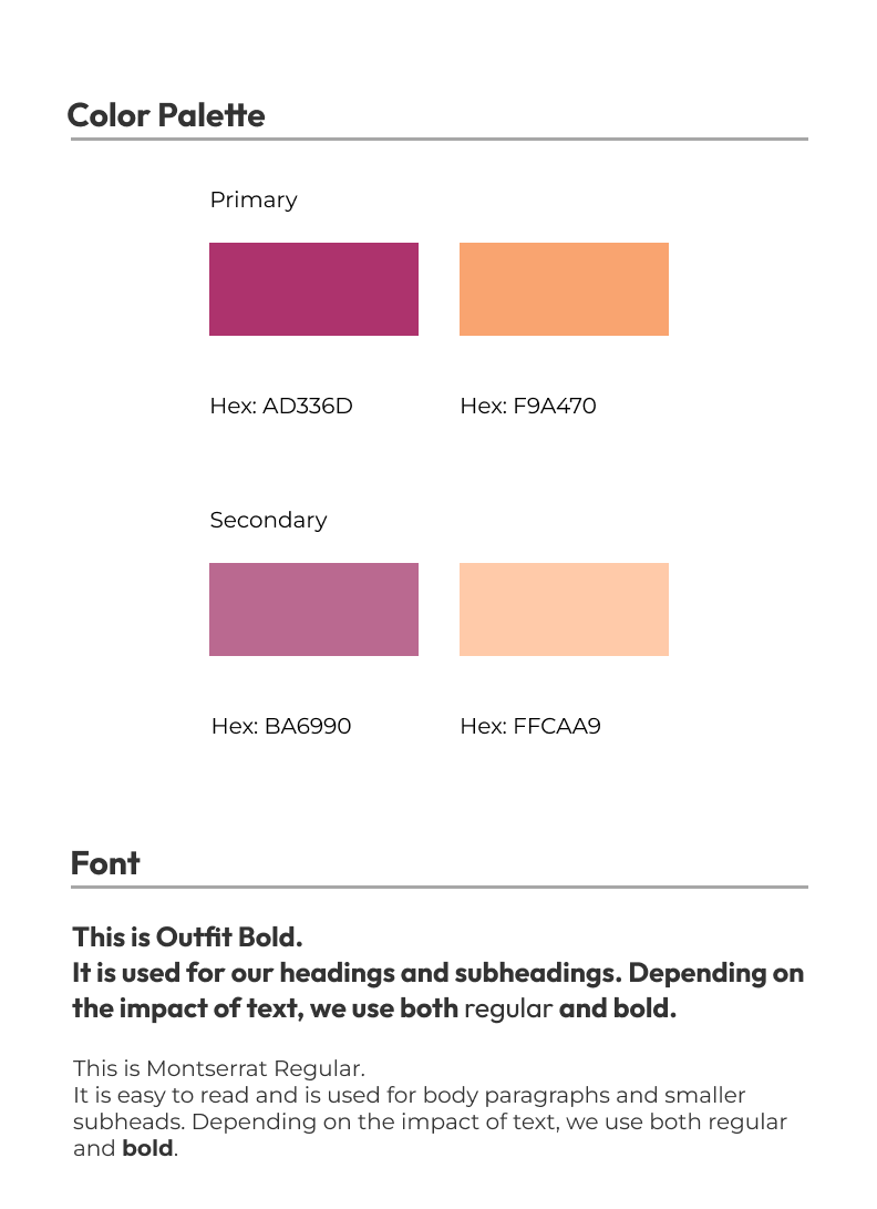
When choosing the primary and secondary colors for the application, I made sure to keep accessibility in mind. My team wanted to go with a brighter orange, however after utilizing an online contrast checker, we used a lighter more brownish orange to meet accessibility guidelines.
Mid-Fi Prototype, User testing, and Iteration
Using the V3 prototype as our baseline, we incorporated the colors and fonts from the style guide. We also started getting more detail focused, which is reflected in the additions of a navigation bar, and adding more copy to the app.
We completed a round of user testing and asked stakeholders to perform various tasks to demonstrate a clear understanding of the functionality of the app, including sharing a sample of work to the community using Feed, discovering resources/people in the community, discovering information regarding community events, uploading personal information, and maintaining a conversation with Chats.
After receiving feedback, the biggest changes we decided to make was to discard Explore due to its redundancy and confusion, and emphasize Connect as an alternative option to discovering new musicians and groups. This would streamline the search process for users and make the options for discovery consolidated on one interface. We also decided to create a second profile page to illustrate relationships between the user and other potential collaborators, introducing elements such as a ‘Request’ or ‘Message’ feature. Other minor updates included a ‘Make Chat’ feature, indicating events in Events, and adding the option for ‘Settings’ in Profile by taking it out of the sidebar.
Adding to the design system
Throughout the project, one of the biggest things we struggled with was coordinating a standardized approach between the 6 of us. While I did a significant portion of the prototyping, it was a group effort, and as such creating a succinct style guide was important to create a standardized prototype.
This is also the stage of the project where we named the application. We came up with the name Triton Jam because “Triton” indicates the scope of the community we are designing for (UCSD’s mascot is the Triton) and “Jam” connotes musicians coming together to create music. The logo we created also references this idea as it includes the color scheme of the app, a musical note for the letter “J” and the “m” ending in the Triton symbol.
Hi-Fi prototype, User Testing, and Iteration
Our main goal for this prototype was to increase the interactions in the application, and change anything in the application that was confusing to users.
We prioritized eliminating the frustration and confusion reported by stakeholders with the mid-fidelity prototype concerning Feed, Forum, Profile, Explore, and some navigation elements. During testing, some stakeholders conveyed that the intent of Feed and Forum was unclear. To address this, we removed elements such as community highlights to reduce clutter and added more examples of posts to demonstrate how to use the pages. We also removed repetitive elements from Profile such as the groups and people near you sections as stakeholders described that the page was cluttered and these elements were already present on other pages. To further clarify how to use Profile, we created an edit profile button as stakeholders were unsure how to edit the profile in the previous iteration. For Explore, stakeholders felt that there were too many features which obscured the function of the page and made it “overwhelming”. We realized that it contained several repetitive elements from other pages and decided to design around the intent of facilitating exploration and connection with other musicians.
Final Design Evaluation
Our final design solution encompasses a consolidation of different ways users are able to connect, explore, and find events through the music community that they are located closest to. This includes a mobile application with a navigation bar that leads to different pages, including Feed/Forum, Profile, Events, and Chats. All of the pages are centered around human design to facilitate connection through the application, encouraging social interaction through features such Feed and Chats. Although the design draws inspiration from existing social media applications, our team incorporated unique features that allowed for connections to become built around musicians or aspiring artists.
Future Work
1. Implementation: While outside of the scope of this project, if we were to continue this project, we would like to implement Triton Jam. This would take our project from theory to reality in terms of helping to facilitate community and collaboration among musicians. It would also allow for more data points to iterate over the design of the application. For example, we could measure the success of certain features based on how often users use them, data that is difficult to get without implementing the application. Hence, we could use statistically driven analysis in order to create a more usable and successful product.
2. More Features: We want to incorporate features that we were not able to address with the current resources and timeline for this project. This includes a video and voice chat feature for users to interact with in Chats, and also an integration of Profile with other streaming services, such as Spotify and Apple Music, to help create more engagement and connection between users who wish to share more information regarding their music taste.
3. Increased Scope: We want the project to become applicable to communities beyond UCSD, such as other college campuses or another radius.
Reflection
Embarking on a mission to connect musicians with each other tested my ability to adapt quickly to process a large amount of data from multiple rounds of research, collect feedback from stakeholders, and translate the findings into an impactful, thoughtful, and valuable design solution. Through multiple rounds of user testing certain features were iterated upon multiple times, such Feed and Forum, to create our final design of Triton Jam. My team used the feedback we had received from our prototypes to address the problem of collaboration in the music community at UCSD. We discovered the importance of feedback at every stage as it helped inform our design and process decisions. This helped make Triton Jam valuable and usable by the community we designed for. There are future improvements that we did not have the time to explore, but I believe this iteration of the design would increase connection and collaboration in the music community.
© Zoe Lederman 2022